

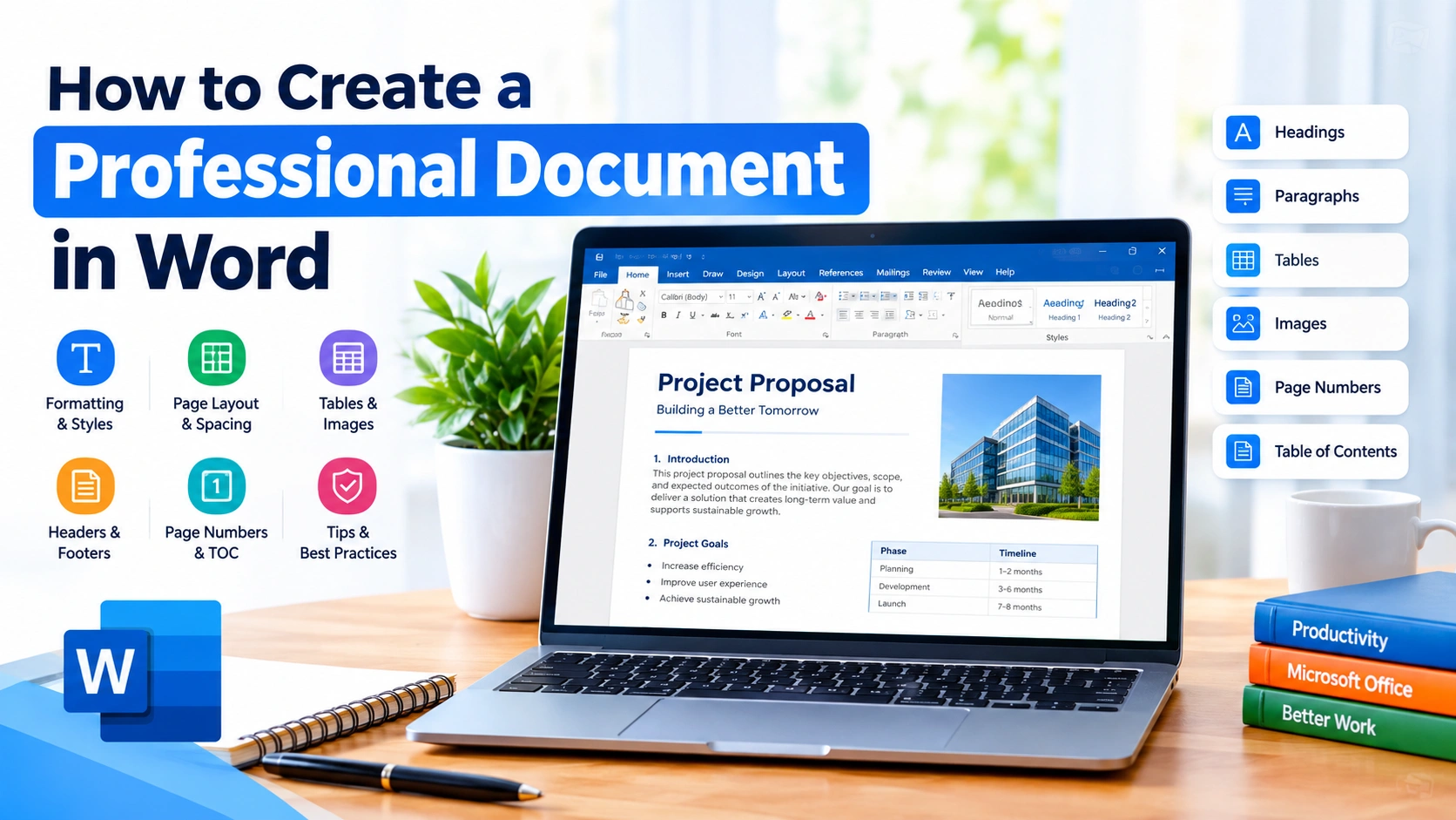
Creating a professional document in Microsoft Word is about more than typing text and choosing a nice font. A well-designed document should have a clear structure, consistent formatting, readable typography, and a polished appearance.
Whether you are preparing a business report, resume, proposal, school assignment, project document, or formal letter, Microsoft Word provides the tools you need to create professional-looking documents without advanced design skills.
In this guide, you will learn how to create a professional document in Word using practical formatting techniques, built-in styles, page layouts, headers, tables, images, and other useful features.
Why Professional Document Formatting Matters
A document with inconsistent fonts, uneven spacing, poorly aligned elements, or confusing headings can be difficult to read. Professional formatting makes information easier to understand and gives the document a more organized appearance.
Good formatting can help you:
- Make important information easier to find
- Improve readability
- Create a consistent visual structure
- Present information more clearly
- Make business and academic documents look polished
- Reduce unnecessary manual formatting
The key is consistency. You do not need complicated graphics or excessive colors to create a professional document.
1. Start With the Correct Page Setup
Before adding large amounts of content, configure the basic page layout.
Open Microsoft Word and create a new document. Then go to Layout and review the following settings:
- Margins
- Orientation
- Paper size
- Paragraph spacing
- Page breaks
For most professional documents, Portrait orientation and standard margins are appropriate.
If your document contains wide tables, charts, or other horizontal content, Landscape orientation may be more suitable for specific pages.
Setting the page layout first helps prevent formatting problems later.
2. Choose a Professional Font
Font selection has a major impact on the appearance of your document.
For professional documents, use a clean and readable font. Common choices include fonts such as Aptos, Calibri, Arial, or Times New Roman, depending on the document requirements.
Avoid using several different fonts throughout the document. A simple approach is to use:
- One font for the main document
- A larger or bold version of the same font for headings
- Consistent sizing for body text
For example, you could use 11 or 12-point text for the body and larger sizes for headings.
The goal is readability rather than decoration.
3. Use Word Styles for Headings
One of the easiest ways to make a document look professional is to use Word’s built-in heading styles.
Instead of manually changing the size and weight of every heading, select the heading and choose a style such as:
Home > Styles > Heading 1
Use different heading levels to organize the document:
- Heading 1 for major sections
- Heading 2 for subsections
- Heading 3 for smaller sections
Styles provide consistent formatting throughout the document.
They also make it much easier to create an automatic table of contents later.
4. Create a Clear Document Structure
A professional document should have an obvious information hierarchy.
For example, a business report might contain:
- Title
- Executive Summary
- Introduction
- Main Discussion
- Results
- Recommendations
- Conclusion
- References
Use headings to separate these sections rather than relying on bold text alone.
A clear structure allows readers to scan the document quickly and locate the information they need.
5. Format Paragraphs Consistently
Paragraph formatting is just as important as font selection.
Select the text and use the Paragraph options to control:
- Alignment
- Line spacing
- Indentation
- Spacing before paragraphs
- Spacing after paragraphs
For most professional documents, left alignment provides good readability.
Avoid manually inserting multiple spaces to position text. Use Word’s alignment, indentation, tabs, and paragraph settings instead.
This keeps the document stable when you edit or add content.
6. Use White Space Effectively
A common mistake is trying to fill every available area of a page.
Professional documents use white space to separate sections and make content easier to read.
You can create better white space by adjusting:
- Paragraph spacing
- Heading spacing
- Margins
- Line spacing
- Section breaks
Do not use repeated blank lines to control the layout whenever possible. Paragraph and spacing settings provide much better control.
7. Create a Professional Title
The first page should immediately tell readers what the document is about.
A simple title page might contain:
Document Title
Short description or subtitle
Author name
Company or organization
Date
Keep the design simple. A professional title does not need excessive colors, decorative fonts, or large graphics.
Use alignment and spacing to create a clean visual hierarchy.
8. Add Headers and Footers
Headers and footers can make longer documents easier to navigate.
Go to:
Insert > Header
or
Insert > Footer
Depending on the document, you can include information such as:
- Document title
- Company name
- Author
- Date
- Section name
- Confidentiality notice
- Page number
Keep header and footer content subtle so it does not distract from the main text.
9. Add Page Numbers
Page numbers are particularly useful for reports, proposals, manuals, and other multi-page documents.
To add them, select:
Insert > Page Number
Word allows you to choose where the page number appears, such as the top or bottom of the page.
For a polished document, use a consistent position and formatting throughout the document.
You can also configure different first-page settings if you do not want a page number displayed on the title page.
10. Insert a Table of Contents
For longer documents, an automatic table of contents can significantly improve navigation.
The important step is to use Word’s heading styles correctly.
Once your headings are formatted, go to:
References > Table of Contents
Choose an automatic table of contents.
Word will use your heading structure to create the list automatically.
If you later change the document, right-click the table of contents and select Update Field to refresh the page numbers and headings.
11. Use Tables to Organize Information
Tables are useful when information needs to be compared or presented in a structured format.
Examples include:
- Project schedules
- Pricing information
- Specifications
- Financial summaries
- Feature comparisons
- Contact information
Go to:
Insert > Table
Keep tables simple and avoid unnecessary decorative formatting.
Use clear column headings and make sure the text has enough spacing to remain readable.
12. Add Images and Graphics Carefully
Images can improve a document when they support the content.
You can insert an image through:
Insert > Pictures
After adding an image, use Word’s layout options to control how text flows around it.
Choose an appropriate wrapping option, such as:
- In Line with Text
- Square
- Tight
- Top and Bottom
For professional documents, avoid placing images randomly or using too many graphics.
Every visual element should serve a purpose.
13. Add Captions to Images and Tables
If your document contains multiple figures or tables, captions can make them easier to identify.
Select the image or table and use:
References > Insert Caption
You can create captions such as:
- Figure 1: System Architecture
- Figure 2: Installation Process
- Table 1: Project Schedule
Captions also make it possible to create lists of figures or tables in longer documents.
14. Use Bullets and Numbered Lists
Lists are useful for presenting multiple related items.
Use bullet points when the order does not matter.
Use numbered lists when presenting:
- Procedures
- Instructions
- Steps
- Ranked sequences
Avoid creating lists by manually typing hyphens or numbers. Word’s built-in list formatting maintains consistent indentation and spacing.
15. Use Page and Section Breaks Correctly
Pressing Enter repeatedly to move content to another page can create problems when the document changes.
Instead, use:
Insert > Page Break
For documents with different layouts, use:
Layout > Breaks > Section Breaks
Section breaks are useful when different parts of the document need different:
- Headers
- Footers
- Page numbering
- Orientations
- Margins
- Columns
This gives you much better control over complex documents.
16. Keep Colors Simple
Professional documents generally benefit from a restrained color palette.
For example, you can use one primary color for headings and keep the body text in a standard dark color.
Avoid using several bright colors throughout the document.
If the document represents a company or organization, using its official brand colors can create a more consistent appearance.
17. Align Text and Objects Properly
Alignment problems can make an otherwise good document look unfinished.
Use Word’s alignment tools instead of manually adding spaces.
For multiple objects, use options such as:
Shape Format > Align
You can align objects to the left, center, right, top, middle, or bottom.
Consistent alignment creates visual order and makes the document easier to scan.
18. Use Consistent Formatting Throughout
After writing the document, check whether the same types of content use the same formatting.
For example:
- All Heading 1 sections should look the same
- All Heading 2 sections should look the same
- Body text should use consistent font and size
- Lists should use consistent indentation
- Tables should follow a consistent design
- Page numbers should have the same format
Word’s Format Painter can help copy formatting from one section to another.
However, using Styles is generally a better long-term solution for larger documents.
19. Check the Document With Navigation Pane
Word’s Navigation Pane can help you review the structure of a long document.
Go to:
View > Navigation Pane
When you use heading styles correctly, your document’s headings appear in the navigation panel.
You can use this feature to quickly jump between sections and identify structural problems.
It is also useful when reorganizing a large report.
20. Proofread Before Sharing
Professional formatting cannot compensate for spelling and grammar mistakes.
Before sending the document, review it carefully.
Use Word’s spelling and grammar tools, then read the document yourself.
Check for:
- Spelling mistakes
- Grammar errors
- Incorrect names
- Missing words
- Duplicate sentences
- Incorrect numbers
- Inconsistent terminology
- Broken formatting
Reading the document from beginning to end is often the best way to find problems that automated tools miss.
21. Check the Document in Print Preview
A document may look fine while editing but appear differently when printed or converted to PDF.
Use:
File > Print
to preview the document.
Look for:
- Headings appearing at the bottom of pages
- Tables extending beyond the margins
- Images overlapping text
- Empty pages
- Incorrect page breaks
- Missing headers or footers
Fix these problems before distributing the final version.
22. Save the Final Document Properly
When your document is complete, save the editable version as a Word document.
Use:
File > Save As
and select the appropriate format, such as Word Document (.docx).
If the document is intended for distribution and should not be easily modified, you can also export it as a PDF through:
File > Save As
or
File > Export
Choose PDF when preserving the final layout is important.
23. Create a Professional Document Template
If you frequently create similar documents, consider building a reusable Word template.
A template can contain:
- Company logo
- Standard fonts
- Heading styles
- Colors
- Headers and footers
- Page numbering
- Standard margins
- Frequently used tables
Save the template as a Word Template (.dotx).
This can save considerable time and ensure that future documents maintain the same visual identity.
Common Mistakes to Avoid
When creating a professional document in Word, avoid these common formatting problems:
Using Too Many Fonts
Multiple fonts can make the document look inconsistent. Stick to one or two complementary fonts.
Excessive Formatting
Bold, italic, underlining, colors, and large text should be used selectively.
Manual Spacing
Do not use repeated spaces or blank lines to position content. Use Word’s layout and paragraph tools.
Inconsistent Headings
Manually formatting every heading can lead to inconsistencies. Use Word Styles instead.
Oversized Images
Large images can disrupt page layouts and increase file size. Resize and position them appropriately.
Poor Page Breaks
Avoid leaving headings at the bottom of a page with their content separated onto the next page.
Ignoring Accessibility
Use meaningful headings, readable fonts, proper table structures, and descriptive alternative text for important images.
Quick Checklist for a Professional Word Document
Before sharing your document, check the following:
- Page size and margins are correct
- Font is consistent
- Headings use Word Styles
- Paragraph spacing is consistent
- Title is clearly formatted
- Headers and footers are appropriate
- Page numbers are correct
- Tables are properly aligned
- Images are positioned correctly
- Spelling and grammar have been checked
- Page breaks look correct
- Table of contents has been updated
- Document has been reviewed in Print Preview
- Final file is saved in the appropriate format
Conclusion
Learning how to create a professional document in Word does not require advanced design experience. The most important principles are consistency, readability, structure, and careful attention to detail.
Start by configuring the page layout, choose a readable font, and use Word’s built-in Styles for headings. Then add appropriate spacing, page numbers, headers, tables, images, and other elements as needed.
Before sharing the document, proofread the content, check the layout, and review it in Print Preview. For recurring projects, creating a reusable template can make the process faster and more consistent.
With these techniques, Microsoft Word can help you produce documents that look organized, polished, and ready for professional use.